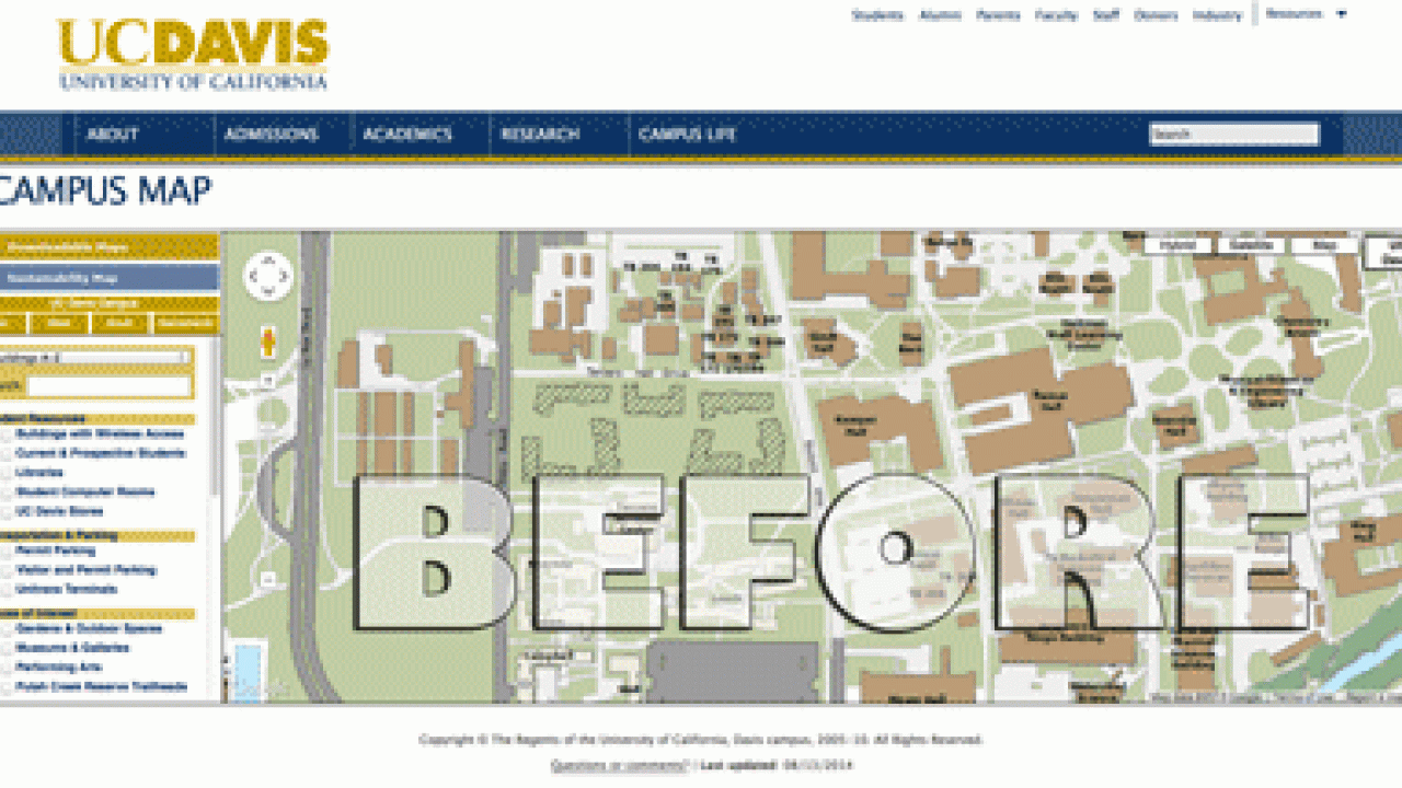
The 5-year-old online campus map has been given a facelift, with additions that allow users to search for departments, and click on buildings to find out what’s inside.
Overall, the new map is simpler and gives more screen space to the actual map.
“We basically streamlined it and just made it look a little better and easier to use,” said Chris Di Dio, geographic information system analyst in Campus Planning and Community Resources. “We just thought it was time for a change. The more I looked at that old map, it looked cluttered.”
The redesigned map shrinks or removes links that previously took up about a third of the height of the screen, and simplifies many of the options at the left of the page. The URL remains the same, campusmap.ucdavis.edu, and so do all of the links associated with the map — so, if you linked previously to, say, Mrak Hall, the link still works with the new map.
Di Dio and his team gave high priority to allotting maximum space to the map itself. He said one of the main challenges that came up during the process was finding a way to display the entire 5,300-acre UC Davis campus.
“Most campuses are a third or a quarter of the size of this,” he said. “We just have so much space to show.”
Di Dio said Web traffic statistics show the online map is used primarily by people off campus, but his team added one feature that should appeal to students, faculty and staff: the ability to search for departments.
Students “may know where to go for a certain class, but that may not be where the department is housed,” said Josh Babcock, a Repro Graphics programmer who makes the map function.
The map still includes photos of buildings and other facilities, but, instead of popping up in boxes on top of the map, the photos appear to the left of the map. Each photo is larger, and each building photo is accompanied by related information, such as the building’s occupants (with links to those departments and units), and links for directions and parking.
The interactive map, which is layered on top of Google Maps, mirrors the color scheme and look of UC Davis’s print maps and map stands. Andrew Larsen, a communications analyst who worked on the design of the new map, said the redesign team looked at other university maps and found about a dozen they liked.
“We tried to implement the best features of what we thought worked well in terms of the layout, navigation and the way all the menus are set up,” he said.
A mobile version of the new map is also in the works, but an estimated release date hasn’t been set.
Media Resources
Dave Jones, Dateline, 530-752-6556, dljones@ucdavis.edu